
Hi MYOB,
I am not sure if the team who design the Business UI have ever tried to use it in a real life situation because it is very cluttered with messages that waste so much space. Despite di...
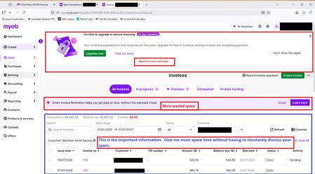

Thanks for your post Alan! We'll be sharing this one with our product teams and have updated the status to open for other members of our community to vote and add weight to your idea.

Thank you AmandaMYOB
I hope your team will understand that this issue goes way beyond just this screen. This was today's frustration. Every Business screen seems to need significant review of how intuitive and clear they are.
As I mentioned before, while I am not blind (I may be slightly colour blind), I struggle to even see boarders around drop down lists and other items due to the lack of contrast in the colour scheme. Without a properly thought through scheme that does not cater to all abilities MYOB is failing your users.