
Hi MYOB,
I am not sure if the team who design the Business UI have ever tried to use it in a real life situation because it is very cluttered with messages that waste so much space. Despite di...
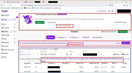

Additional to the clutter interface issue....go to the Uploads, the top of the screen now has its own dashboard displaying 3 options: download application; phone capture; email. These 3 options are displayed permanently. And when I split my screen to download directly from a desktop file the download application in uploads is no longer accessible. Not only is this a waste of space at the top of the screen, but you really are insulting my intelligence by over complicating a system that needs to return to the basics of AR!